Hello + Welcome
While trying to create some form of a portfolio last year, I had an aching desire to record my progression as a 3D Artist in a less ‘formal’ way, while allowing me the chance to connect with those in the industry and like minded people. 2 failed WordPress accounts later and Voila!
My first printed portfolio had the subtitle ‘Vol 1’. It seemed like a great idea to have a body of work segregated by volumes – a tenuous attempt to display an organised set of projects, while creating pages of work I hoped would encourage greater improvements.
I think documenting the development of my understanding of my profession and the previously mentioned stagnation as a so called artist allows me to stay as true to my passion, at a level I feel it warrants.
To begin I thought I would take the opportunity to post my current workflow. For sheer simplicity I’ll use one of the first lighting studies I produced about 9 months ago.
Incremental Updates
My workflow hasn’t hugely changed since then, apart from the minor adaptions to material creations and my understanding of lighting. Any disparity in the adjustments to my workflow when you read this will be updated later on in the year, assuming my workflow will have changed enough to, sort of warrant posting. If not, assume the worst!

Depending on the project I’m working on, whether it is a project for a client where proposed designs have been presented or a personal project that relies on referencing images, the source of information with which my project will be based on is a priority. This also might include me sketching out what ideas I might have before I’ve even opened up any piece of software.
Referencing
I congregate all the necessary information I’m going to need for the project, such as materials, dimensions and any other info that can help me with the creative direction. At work, I’m given palettes that range from fabrics, metals, to concretes to glass; whatever materials are going to be seen in the scene. I’ll either scan these in or browse the manufacturers site to see whether they have better quality images than I can get by scanning.
When it comes to my own projects, I try to find as many examples of a certain material and arrange them on a PSD file to use as referencing.
Once I’ve sourced everything, I begin colour correction in Photoshop, if necessary (as most materials appear either too saturated or too dull than what the actual material). I’ll use a combination of the Curves, Hue Saturation and the Color Balance tools to correctly amend the colours.
Folder/File names
This means that appropriately named folders becomes as much an asset, or liability as the machine you’re working on. One thing I’d like to mention is that whatever folder system I initially begin with inherently changed/evolved due to the adjustments of my workflow. Word of warning. If you find yourself having folders empty, albeit with the initial intention to dump ‘useful’ stuff into it, get rid of it. Empty folders are a huge middle finger when you’re looking for that image or material.

Naming Conventions
I try to ensure that I have consistent naming conventions for all my files. Important when you’re working with another team member(s) but a habit you should nonetheless develop independently. I work using the name of the project followed by an underscore, the location (geographically) of the project and then the version number. If amendments (I say if, when are there not?), then I include another underscore followed by a letter after the version number.
Shell
Once I have a good understanding of what is needed, I usually begin with what `I and some others call the shell of the scenes, simply the architecture. Since this scene required only a floor and one rear wall It was fairly simple to block in the shell. As soon as that’s done I move on to the smaller parts of the scene.

Modelling
As I rule of thumb, I start from the largest objects progressively working down to the smallest, this also applies when creating the components of an object. At least this way, if I’m tight on time, the parts of the model that will most likely been seen first will be complete and the finer details can be added later on in the process if time permits it.
Details
I can be incredibly pedantic when it comes to creating models, despite my lack of extensive experience. I’ve developed a desire to prove to myself that I’m comfortable modelling anything, should the challenge present itself to me, which is why in all my visuals so far, I’ve chosen not to download any models and create them myself from scratch. I think once I’m confident with creating varying degrees of complex topology, I’ll download the odd model. Of course, depending on the nature of your profession, your duty may to purely create models, in which case, knock yourself out!
Create a Model a day
As a beginner, it’s something I highly encourage; this way you’ll not only develop a greater understanding of topology, but also save yourself some cash. Spend time embellishing as much details in your models as possible and refine them as accurately as you can; not only does it allow you to capture your scene from different angles but it allows you to capture the edges of details that pick up subtle highlights, adding to the pursuit of realism.
Lighting
As in all forms of visual art, light will make or break your work. Get this right and half the battle is won.
Masters of this are able to produce incredible pieces of work, often with the simplest manipulation of light. Artsy published a piece here about the phenomena and how it’s been used by certain artists.
Loving Light
My senior has literally and figuratively shed light on ways I can tackle this, a lot of which continue to fascinate me and all of which I find myself just scratching the surface of. My approach to how I light a room is different every time, from one room to another, one set up won’t work for all.
Depending on how I decide to light my scenes will play a crucial part in the look and feel I want to get across. I admittedly love to spend a large portion of time working in post to experiment with mood.
Tip: Theres no such thing as the perfect light. Use whatever lights you need to in order to get the desired result. Once you’ve got the desired result, chip away at lights you find you don’t need and you’ll eventually arrive at lights you find work for most situations. For me at the moment, it’s Vray’s simple plane lights for ambient look and feels, sphere for exagerating specular highlights and photometric lights for IES and the odd rim lighting on furniture.

Clay and White Card renders
Before you actually apply your materials, commit to material overrides and look at you scene and it’s lighting in its entirety. Doing this is simple, create a 90% white ‘Generic’ material and instance it in the ‘Material Override’ tab in Vray (I’ll show how to do this in later posts). This stage, you or whoever needs to look at the scene can ensure dimensions, the position of elements and the overall lighting is looking as desirable as it can at this stage. Usually called a clay or white card render.
Controlling the light


At this stage of the process, light from the environment is usually needed (using a HDRI) but I found that using synthetic lights got the result I was looking for.
HDRI
Lights Role
As we have established, light plays a pivotal role in achieving the look and feel you want.
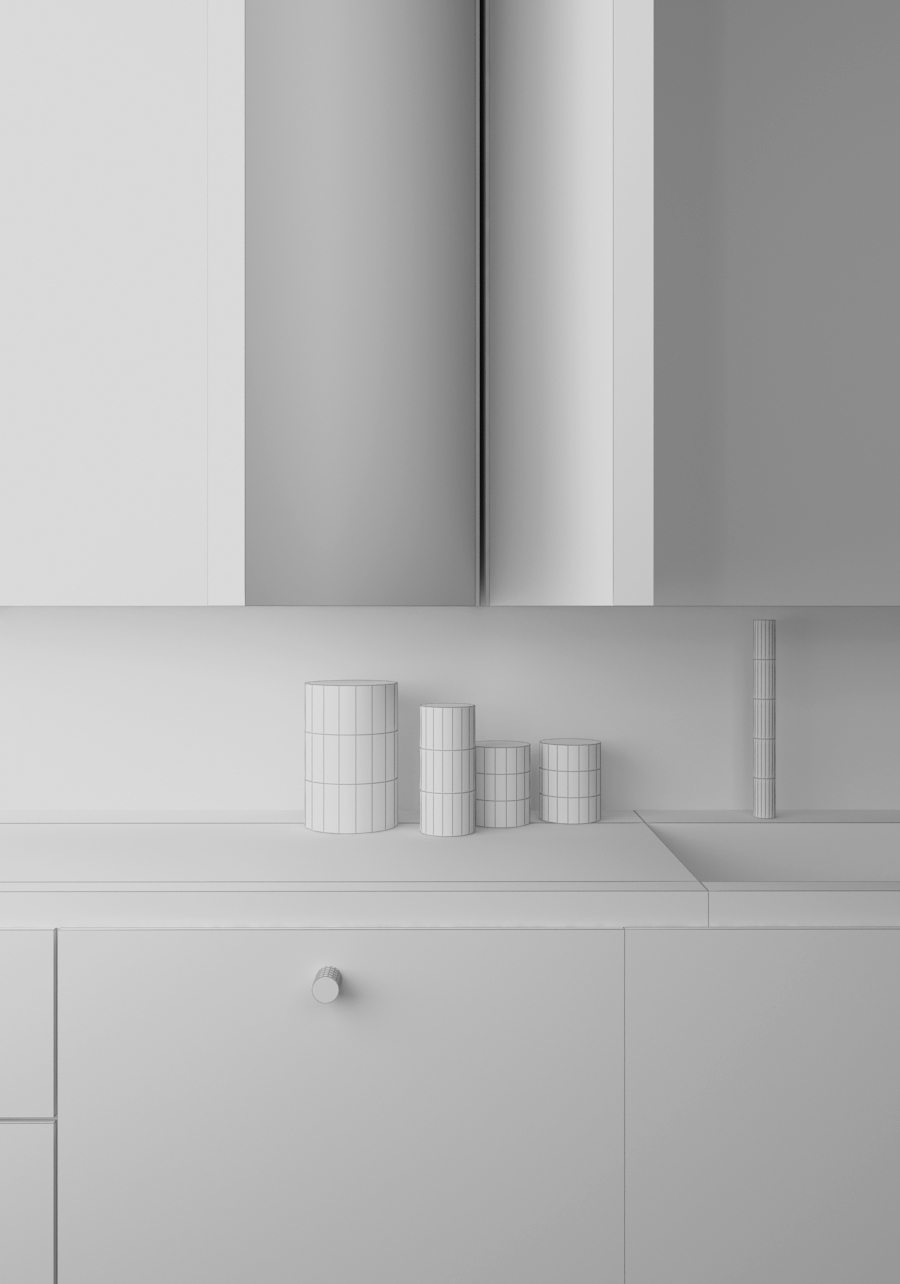
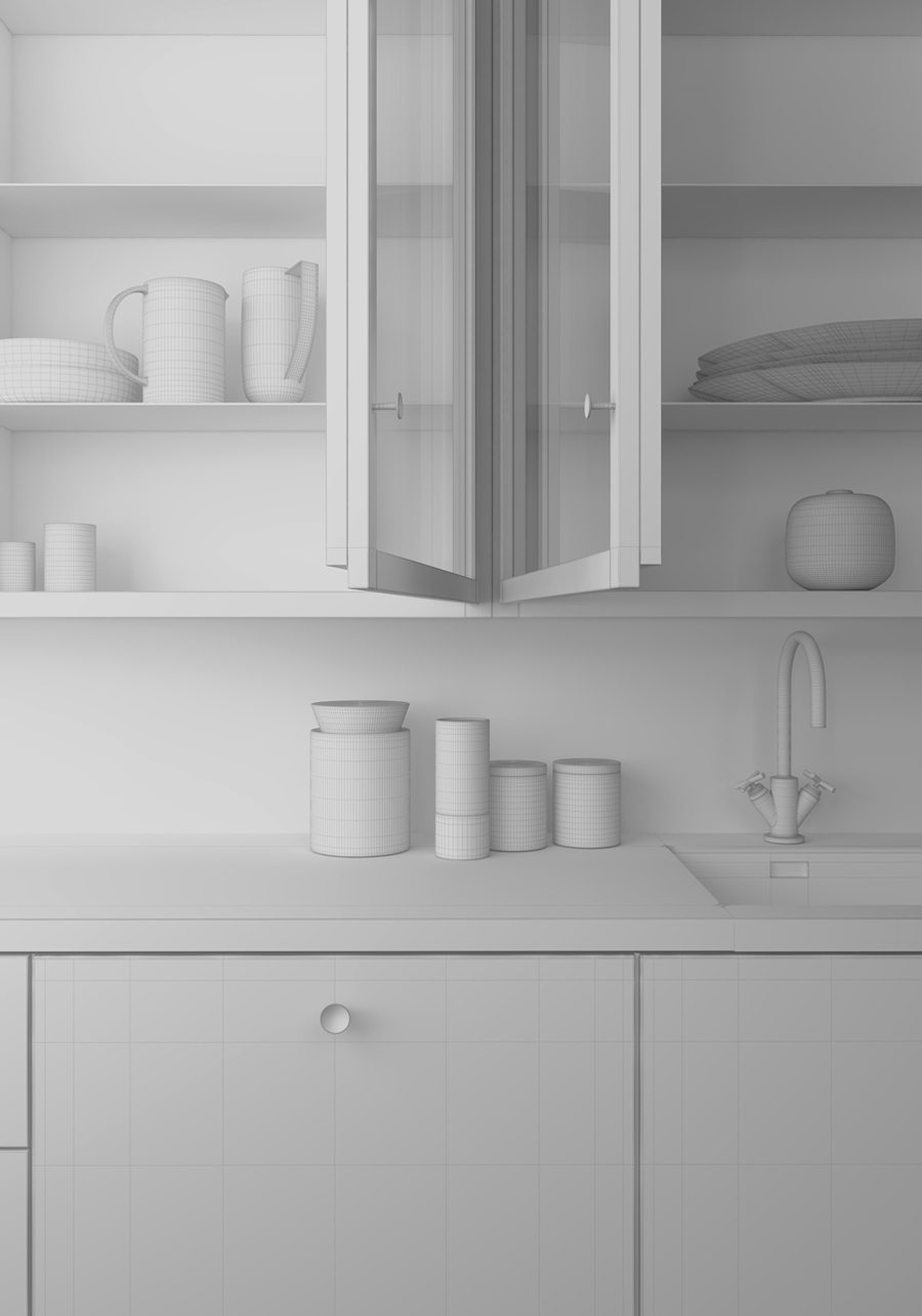
Here you can see a model I’ve lit in different lighting settings.


Hopefully it illustrates the importance of versatility of lighting and how it can drastically change the look and feel of an image.
Shading / Texturing
Shaders have become a primary component of my workflow. Materials, almost as much as your lighting, can make or break your visuals, if realism is what you are going for of course.
The physics behind shading is the phenomena that occurs when the light in your scene interacts with your objects. Shaders can display all sorts of behavior depending on how you set them up, from absorption to scattering to emission.
Layered Materials
The level of complexity in your materials can determine the quality of your materials, but that doesn’t mean complex materials produce realistic results. Much of what makes up your shaders usually consist of many layers or sometimes just the one layer. A layer will determine the ways in which your material reacts to the light in your scene.
The layers I’m referring to are usually made up of either Diffuse, Reflection, Reflection Glossiness and Bump or a combination of all four.
Here is a quick rundown on what some of the shading types can look like:
Diffuse
–
Diffusion dictates how light scatters on top of a surface, and has to do with how rough the object is, An object that is fully diffuse scatters light particles in every angle when they hit the surface. An object with very little diffusion is one that reflects light particles mainly at one angle when they hit an object. Something like a mirror, that is very smooth, has almost no diffusion.
Examples of objects which I’ve found that are heavily diffuse, are bed sheets, sofa fabrics and walls/floors. Materials like these I’ve found usually rely either on the image feed via a bitmap or a bump map to give it extra detail.

Reflection
–
Reflection is determined by the amount of light that bounces back off an object when its hits. An obvious example of a reflective object would be a mirror. Then there are materials such as ceramics that are heavily reflective and then materials such as plastics that are partially reflective.
Reflection also depends on the surface quality of an object too; you may have an extremely reflective bowl, but if it’s been heavily used you’ll begin to notice more of a matted or diffused look. There are also extremely glossy materials, like the panel surrounding most TV screens, or a ceramic plate – they have some level of reflection but they aren’t quite mirror like.
Objects that reflect a lot of light can also appear unreflective like that of snow or pure white paper when the sun shines onto it (which is usually why when it’s sunny and your environment is covered in snow, things looks incredibly bright). I’ve come to realise that, in reality, almost all materials that I encounter in life have some level reflectivity.

Refraction
–
Refraction is the way that light behaves when it goes through a translucent or transparent object, like water or glass. I’m sure we’ve all seen a straw in a glass of water appear to bend in a strange way; When light passes from one medium (material) to another it changes speed. This is because the speed of a wave is determined by the medium through which it is passing. When light speeds up as it passes from one material to another, the angle of refraction is bigger than the angle of incidence and this is where the distortion takes place.

Translucency
–
Referred to as ‘Subsurface Scattering’ materials, which is often abbreviated SSS, is the concept of light going into an object and scattering around inside, rather than on the surface like diffusion. The best way to see this is to look at your hand in front of a light bulb. Sub surface scattering is the red light that is visible when looking at your hand – it’s light bouncing around off your blood and muscles.

Reflection is everywhere
It was also important for me to understand that every single object in the real world has some level of reflectivity. An object that has 100% diffuse, i.e no reflectivity at all is extremely rare (I believe there’s a substance called Vanta Black that absorbs almost 100% light, but doubt you’ll be using it any of you Interior projects. I think it was radioactive). Reflection is also rarely uniform, meaning that the entire surface of an object is seldom 100% polished; most things that have a certain level of gloss and some degree of imperfections too, so maintain a level of irregularity if realism in your visuals is a concern.
The four most important maps I’ve find myself using constantly are the ‘Diffuse‘ map, the ‘Reflect‘ map, the ‘Reflective Glossiness‘ map and the ‘Bump‘ map. All four aren’t essential, nor are they all the maps you need, but they should give you a great start to creating a realistic material. I’ll elaborate on these in future posts too.
Scene Materials
The materials I’ve created are very simple – Diffuse maps works off of a falloff map which has the same image stored in both slots, the darker side is just colour corrected a few shades darker.
I don’t work in the slate mode you see below, I much prefer working in the compact mode but I’m aware a lot of users work using this mode so I’ll display them in slate mode.


My materials are fairly basic, nothing too heavy here. There are a number of things I would do differently (and not at all) but I’ll leave those changes for another workflow ‘installment’.
Rendering
This is the stage in which I begin bringing my scene to life, combining the models I’ve created with the lighting I’ve established. I’m constantly doing test renders to ensure that both my materials and lighting are looking good, to ensure that I don’t spend hours working on them and then doing one large render and realising it looks like crap. As mentioned before I use Vray. I’ve not had any experience using any other rendering software so I can’t give you my opinion on anything a part from Vray, but I’ve not felt the neeed to try anything else as of yet. I’m very curious about FStorm and Corona though – I’ll be happy to give you my opinion once I’ve had experience with either one.

Render Elements
When rendering a scene , the image that is output is called the Beauty render. This render is comprised of many elements such as diffuse color, shadows, lighting, and reflections that are composited together to form that final Beauty look. All these component elements may be broken out into separate render elements which can be used to control different aspects of the final image during compositing.
How does it work?
With this workflow, sometimes called “Back to Beauty” Compositing, many components in the render from its lighting, reflections, and refractions, to its shadows and Global Illumination can be easily adjusted to fine-tune the Beauty render without the need to re-render the scene, saving time and increasing artistic options.

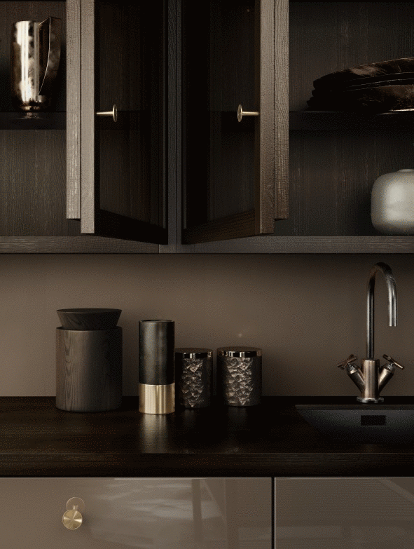
Post Production
The stage in which I begin bringing my scene to life. As mentioned before, lighting is crucial to creating mood, and this stage allows me to do want you want with it. This stage is also where you can really explore the look and feel. This example was easier than usual trying to establish a mood because I my intentions where to emulate the reference image, but in any case, make sure you have an idea of the feeling you want to portray.
I’d highly encourage gathering images you like and study the lighting, seeing how well you can emulate it. Doing so has allowed me to incorporate the things I learn in studies into actual projects, which is the aim.
Exporting
I export all my renders out as 16 bit TIF files. This enables me to work with them in Photoshop and still retain I high amount of information for adjusting levels and curves which I consistently do.

Element Contributions
Elements are an extremely powerful tool that enables me to exaggerate anything from you render that wasn’t obvious enough in my beauty render. Below I’ve are the elements from my scene.


Final Image

Inside Photoshop
I usually begin by importing my passes into one Photoshop file and putting them into their own folder above everything else.

Depending on what part of the image I want to accentuate, I’ll turn layers on and off and play around with the layer styles (Specular, Reflection and refractive passes all benefit from either the ‘Lighten’ or ‘Screen’ mode due to sheer amount of blacks.)
Using the Wire Colour pass to isolate parts of the image I’ll continue to adjust the parts of the image to a point that I feel it looks good – I’ll then begin with the smaller adjustments.
Wire Colour
One of the first things I learned as a Graphic Designer was to work non-destructively, having to make changes to an image that no longer contains its original ‘parts’ is inconvenient and inefficient. Having the ability to go back to the original is one of the many perks of working digitally and it’s a shame when users don’t take advantage of it.
The way in which I try to do that is by utilising my holy grail of passes, the ‘Wire Colour‘ pass.
First time I saw this thing it looked as if an interior designer had been tripping on acid, but it’s this variation in colour which isolates each material (or element depending on which settings you choose) from one another.
Here you can see me manipulating the size and colour of a selected piece of the image without destroying the original. Bare in mind, by not deleting the original image your file sizes will inevitably increase but I think it’s a small price to pay.
Anyone familiar with photoshop may already be doing this, for anyone who isn’t I hope its of some help.
Non-Destructive Method 1:
Step 01 – Select the colours of the object you want to manipulate in the Wire Colour pass layer.
Step 02 – Choose the layer you want to duplicate (with the selection still being made, indicated by what the Magic Wand does).
Step 03 – Hit Ctrl+J to duplicate the selection and you’re done. I recommend putting each amend inside of a folder along with any image adjustments you make.
I’ll upload a video of this method shortly.
Non-Destructive Method 2:
Step 01 – Same as method 1
Step 02 – Choose the layer you want to amend(with the selection still being made, indicated by what the Magic Wand does).
Step 03 – Hit the adjustment layer shortcut and the adjustment you want. Since you have a selection made, what Photoshop will do is apply a mask no matter what adjustment you choose.
This method works best when I need to work on simple changes like curves or levels; all the adjustment layer does is affect the selection and ignores everything else.
I’ll upload a video of this method shortly.
Timelapse
I repeat either one of those methods to adjust the strength of highlights, shadow, reflections, refractions along with any colour corrections I want to make. Below you can see a quick time-lapse of this process.

After going through this workflow, I’ve realised how much I disliked relying too heavily on the post production side of things. Having to make large amounts of amends to architecture and furniture can cause the post side of things to become a huge burden.
Over the last few months I’ve begun trying to create the ‘finished product’ from a raw render – just to allow me better control on delivery of a project. As difficult as it can be to do this, I’m exploring new softwares like Corona and F-Storm, I’ll elaborate a bit more soon.
So that’s it for a brief overview of my workflow – nothing too fancy but I hope it helped.
As my workflow changes, I’ll be sure to elaborate more and continue to provide anything I think might be particularly useful.
I’ll apologise for any typos or mistakes I’ve made as this is one of the many posts I wanted to just get out of my notebook and onto here asap. I’ll make corrections when I get the chance. Thanks again.